Dashboard
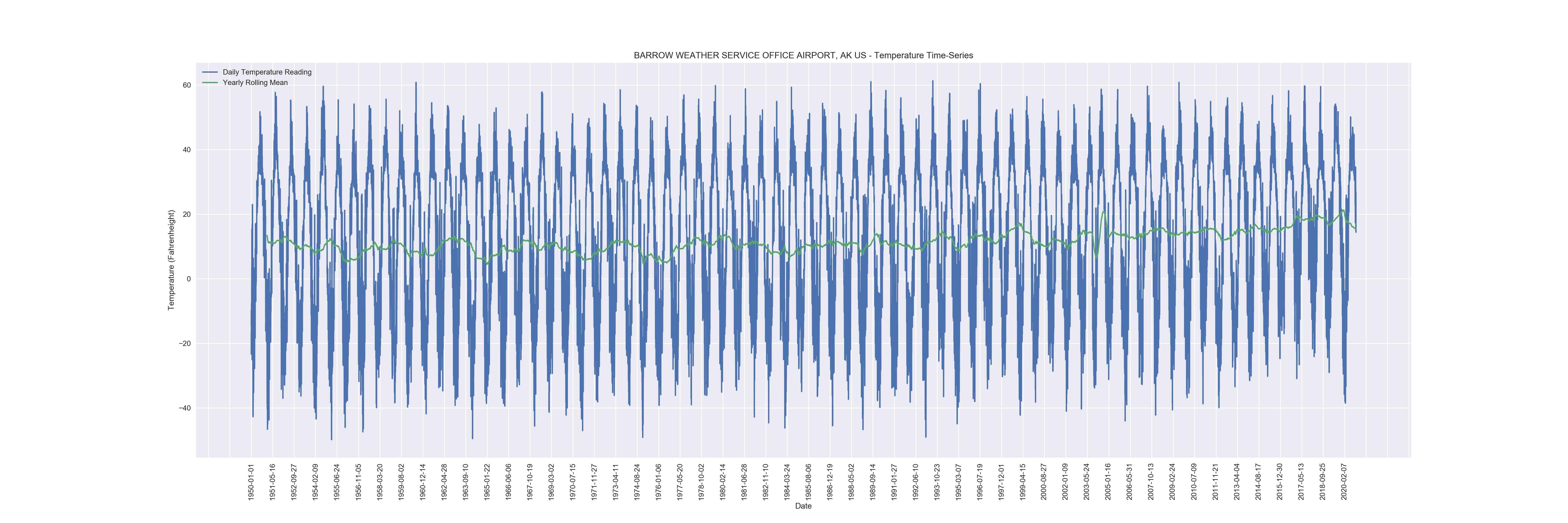
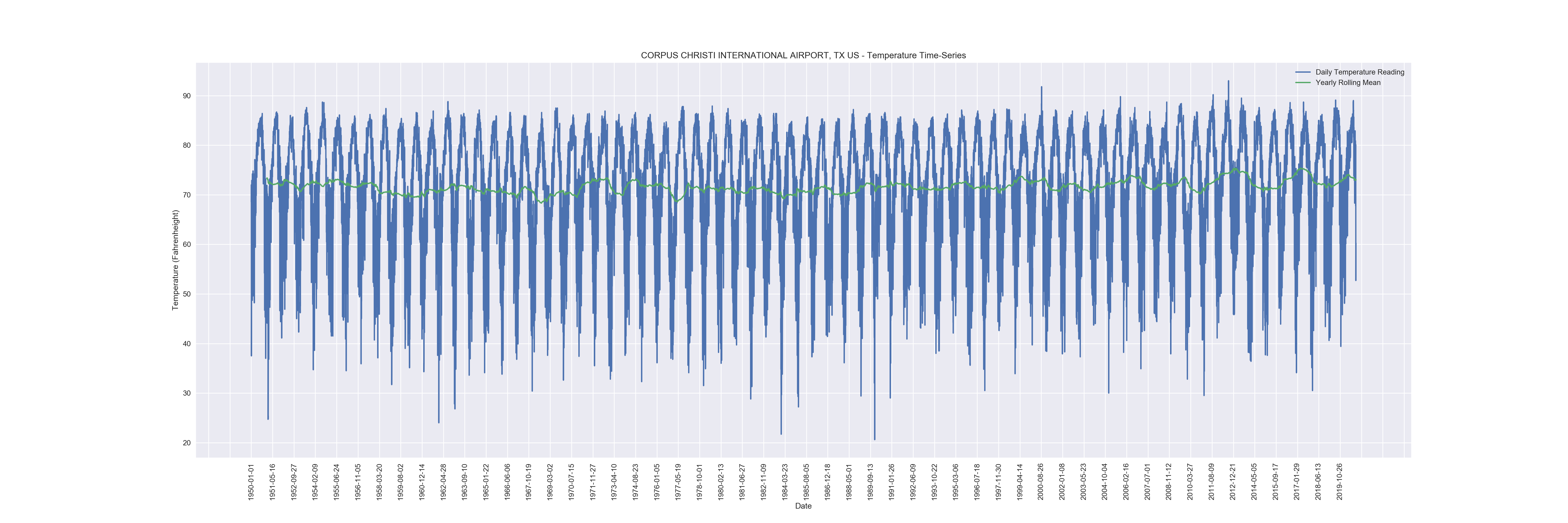
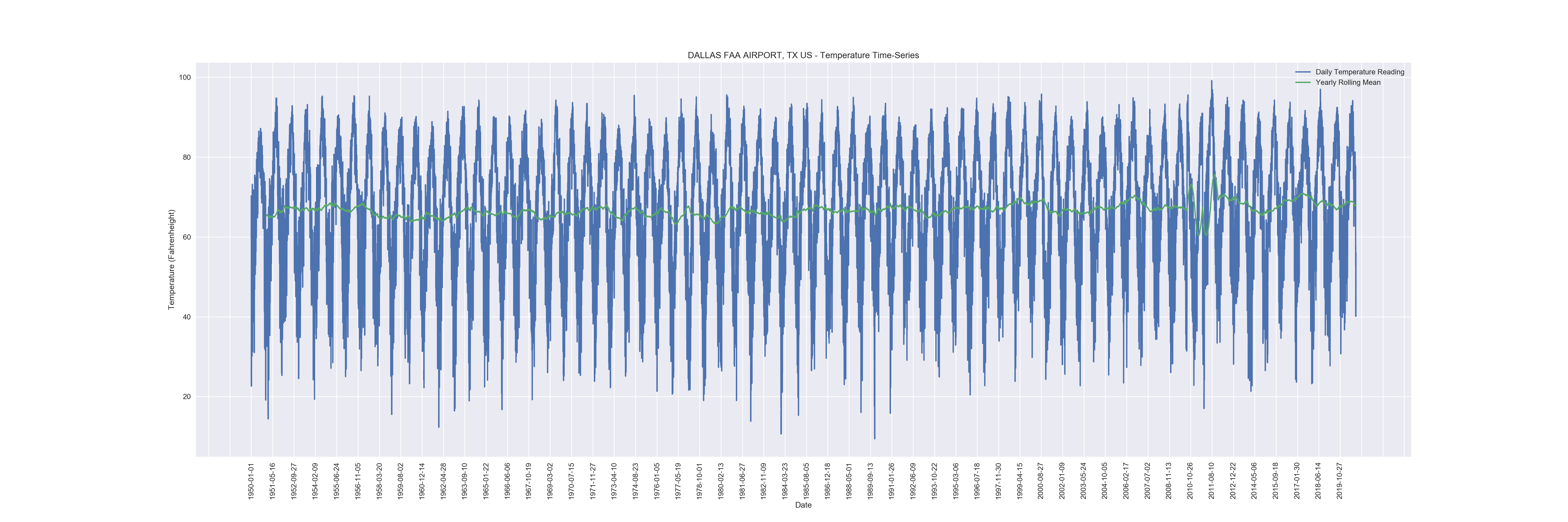
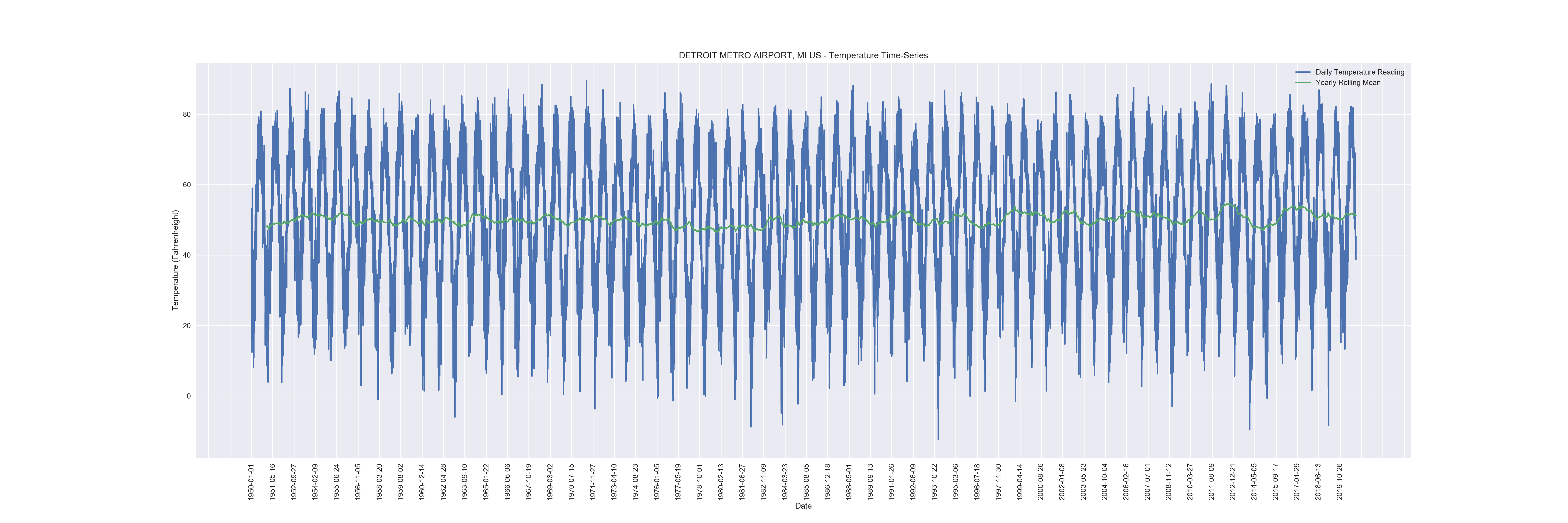
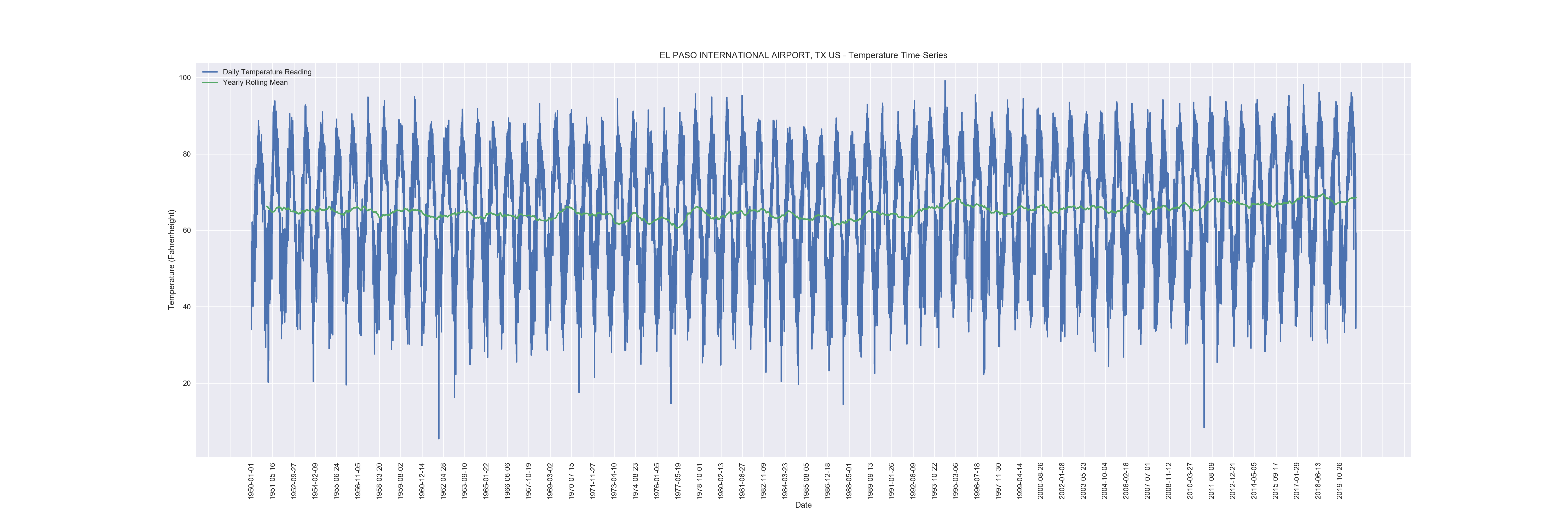
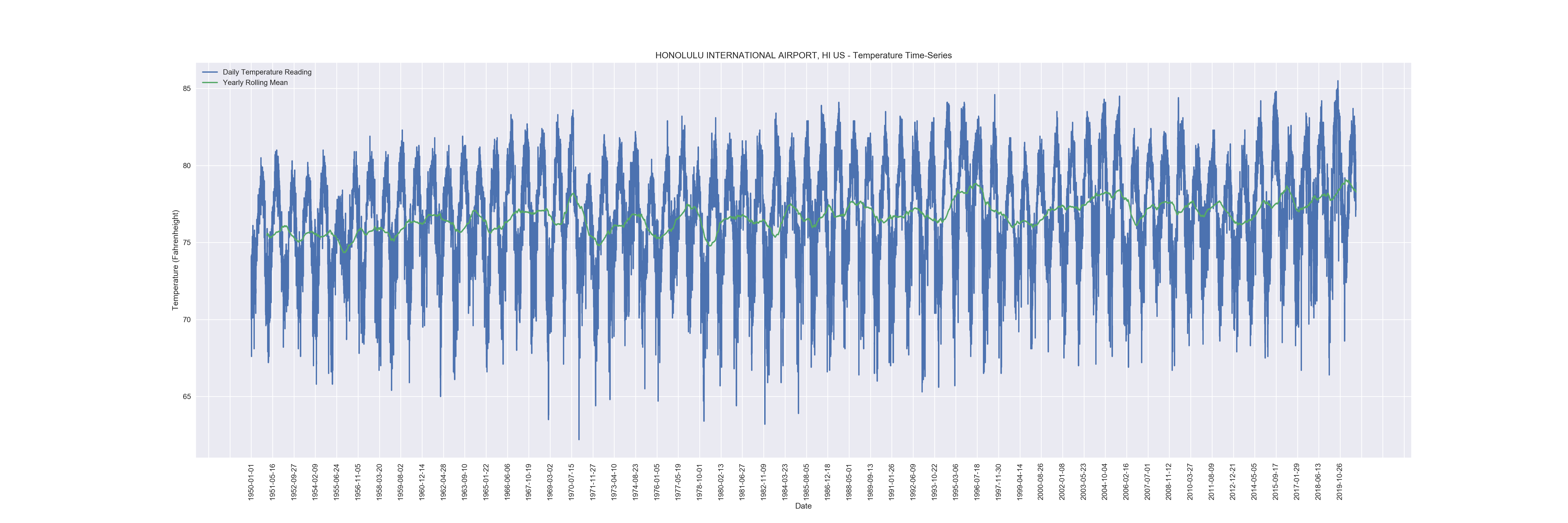
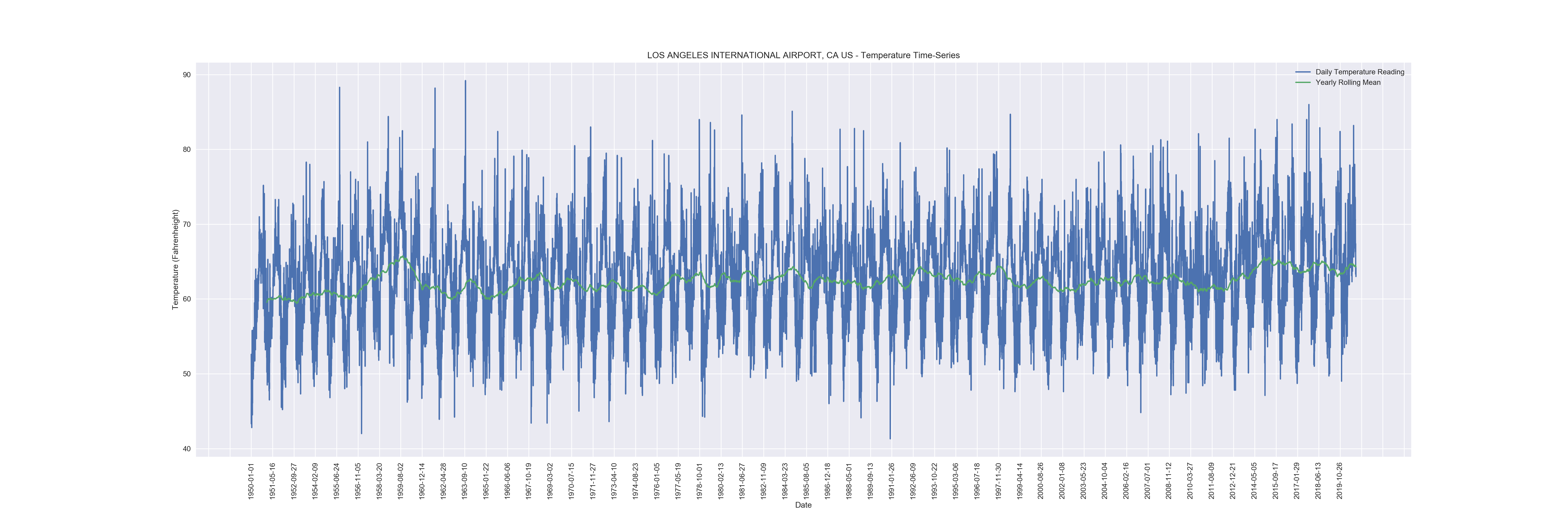
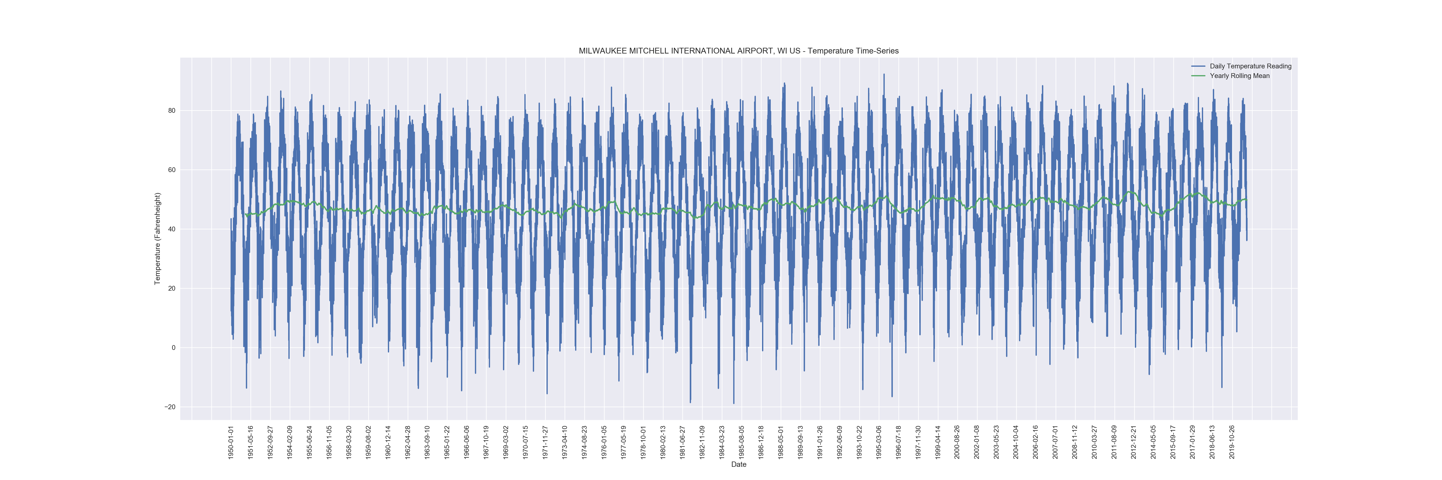
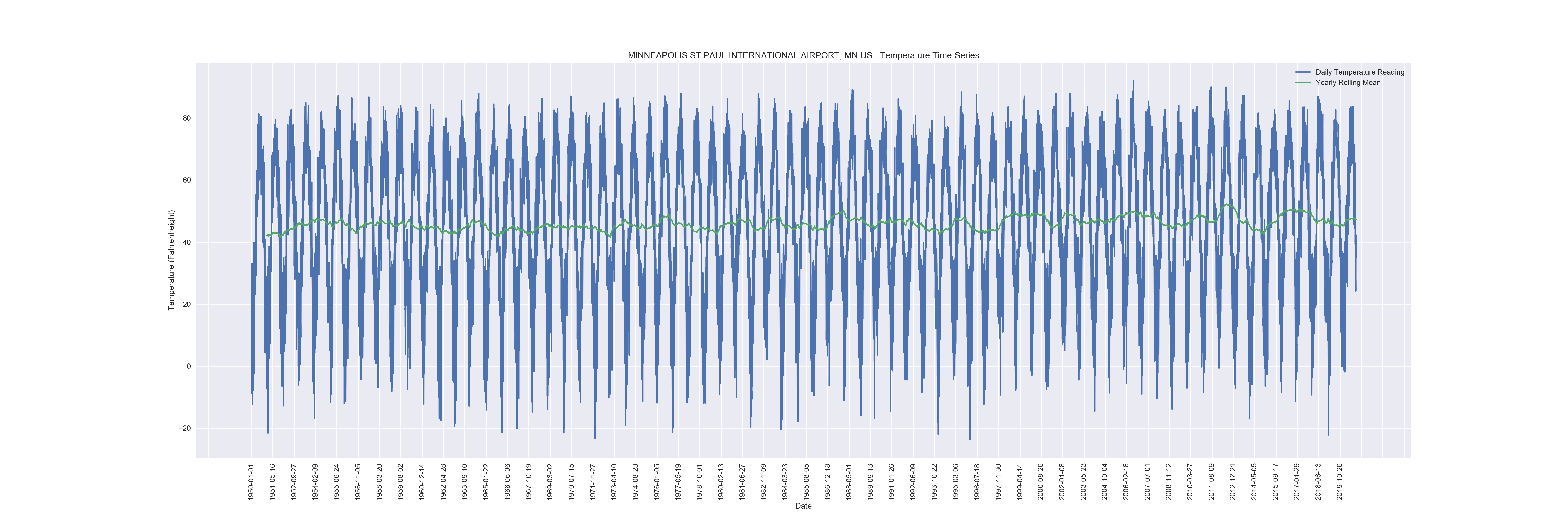
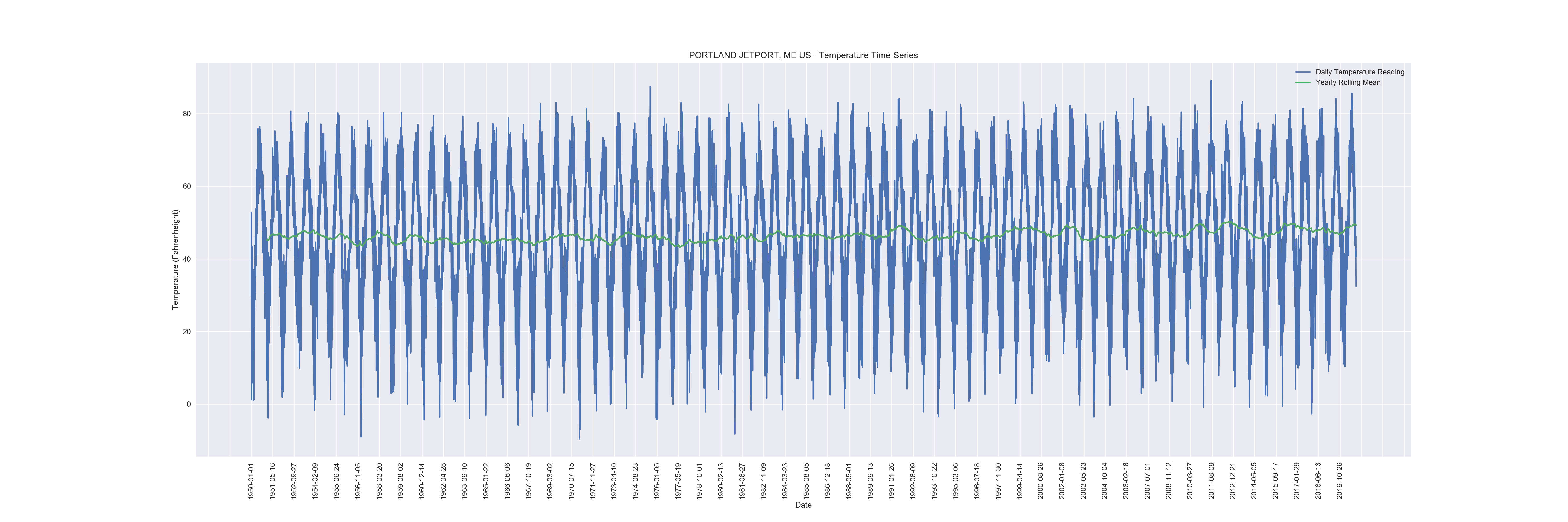
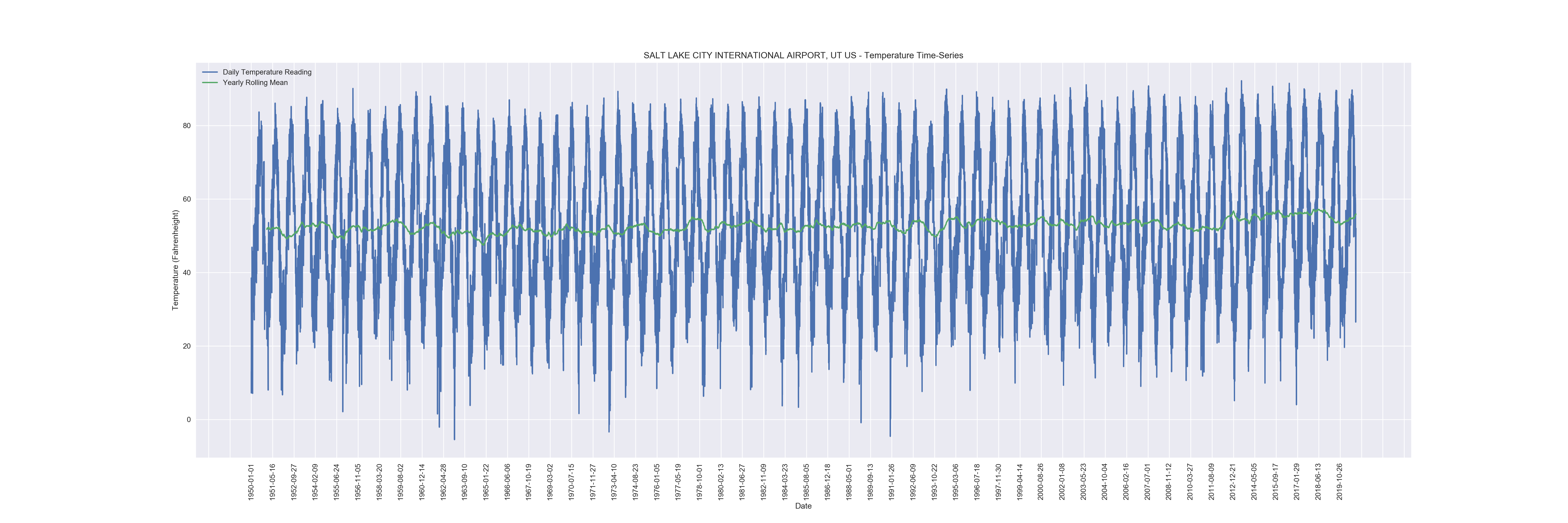
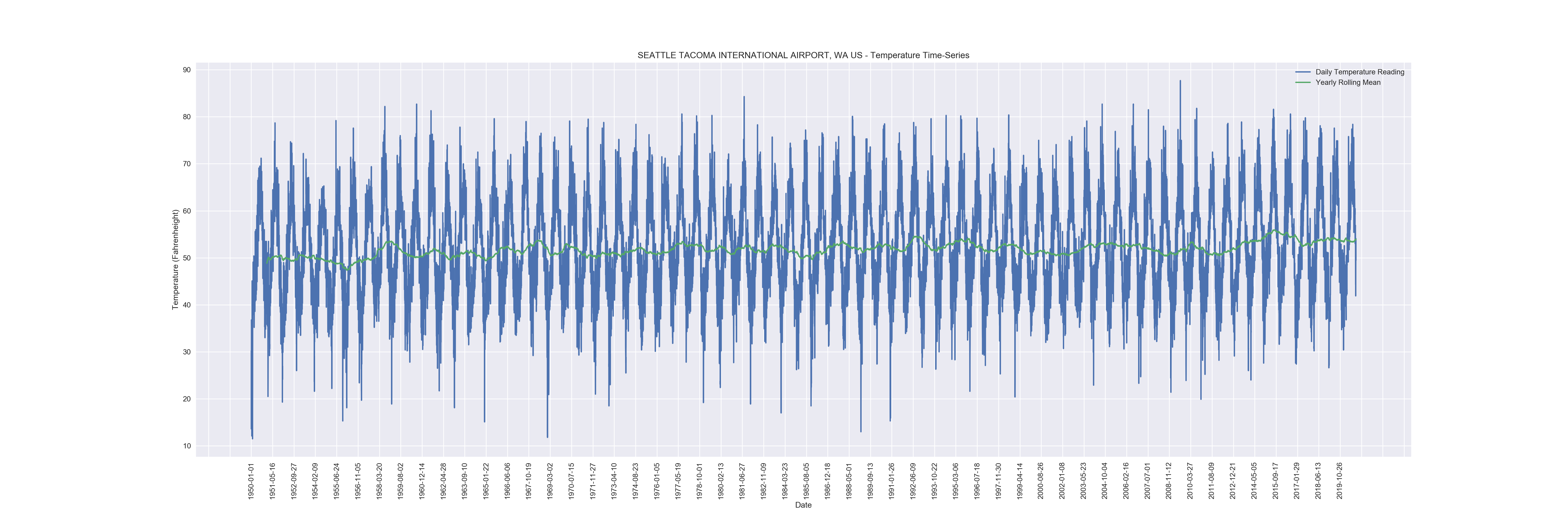
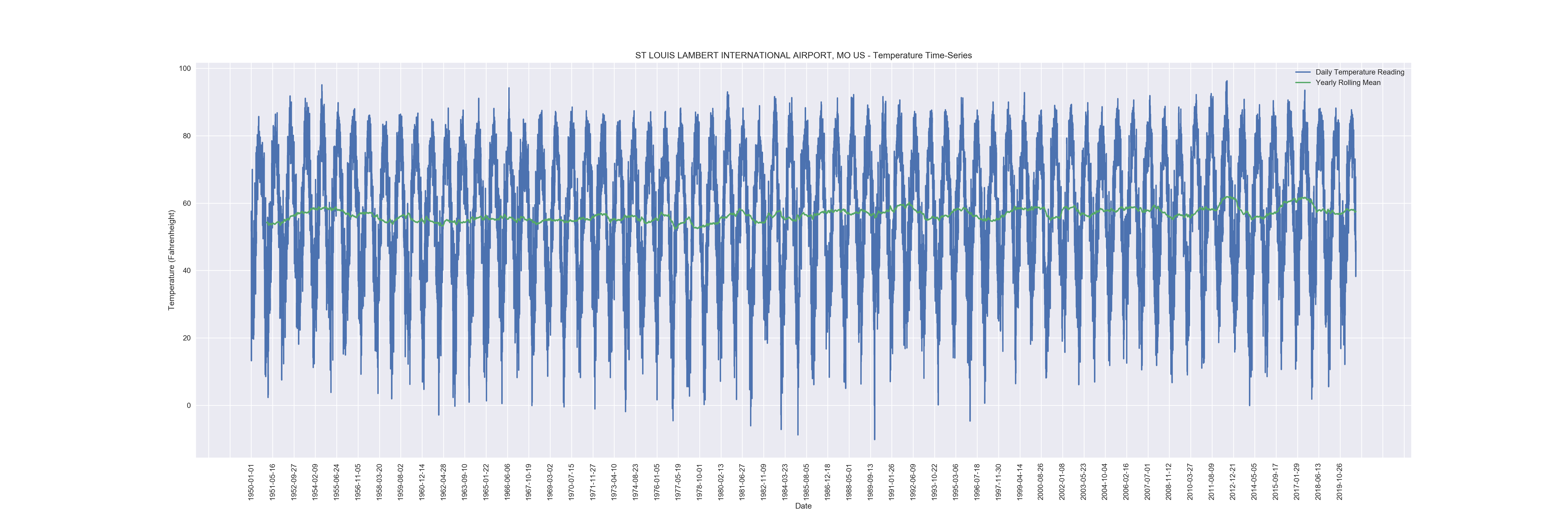
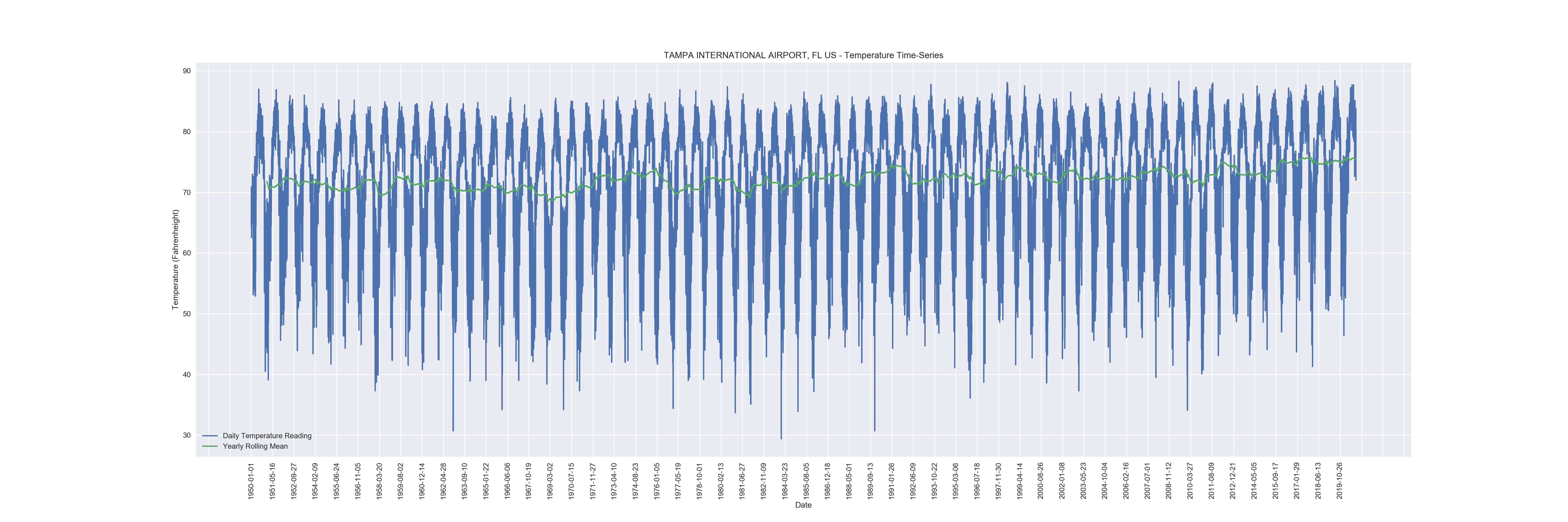
While it seems incredibly difficult to pull any information from the charts when using daily data over seven decades, once a yearly rolling mean is plotted, it’s a bit easier to see where the variability lies in the time series. Looking between the different sites, it looks as though warmer and coastal climates show a steady (if not relatively small) increase over the 70-year period. As expected, warmer climates averages tend to cluster more at higher temperatures with sharp spikes downward during the winter. A great example of this is the Tampa site. There seems to be more yearly variability in the colder climates, which is to be expected as they have a large range in temperatures yearly. It is interesting to note, however, that these coldest sites’ temperatures show their averages most central between their peaks of heat and cold. Almost all charts showed stronger variability in a period between 2011 and 2015; while this may be a sign of increased climate-change across the US, much more analysis would be required to make such a claim.
Individual Station Charts