Dashboard
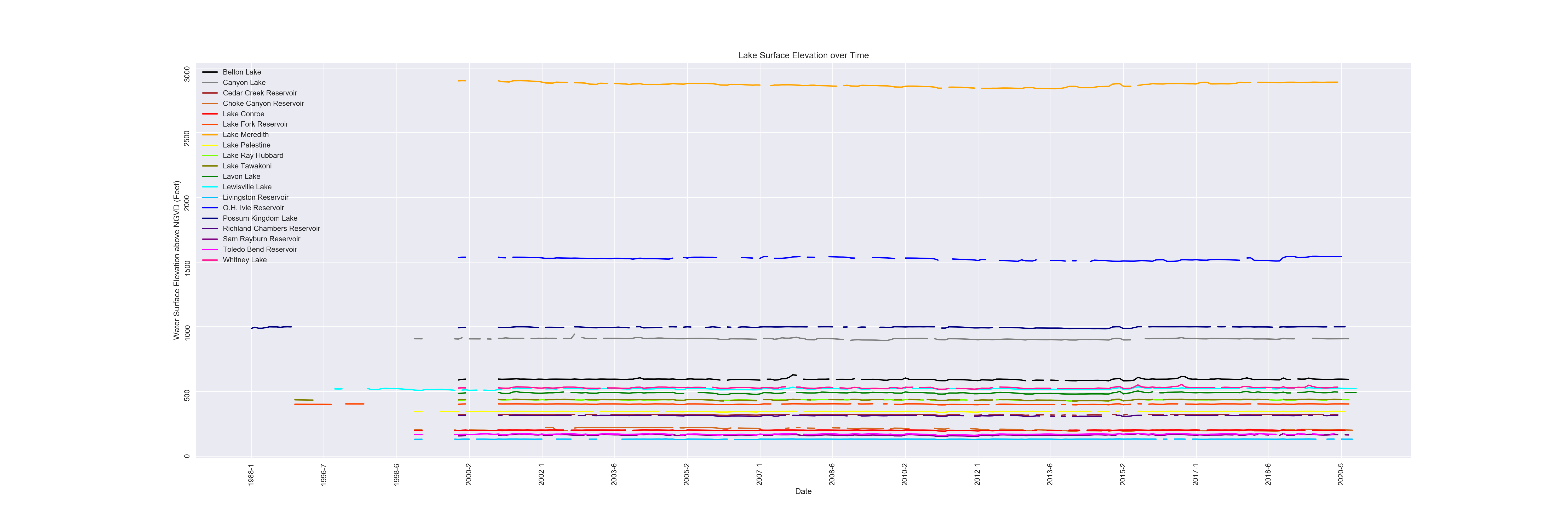
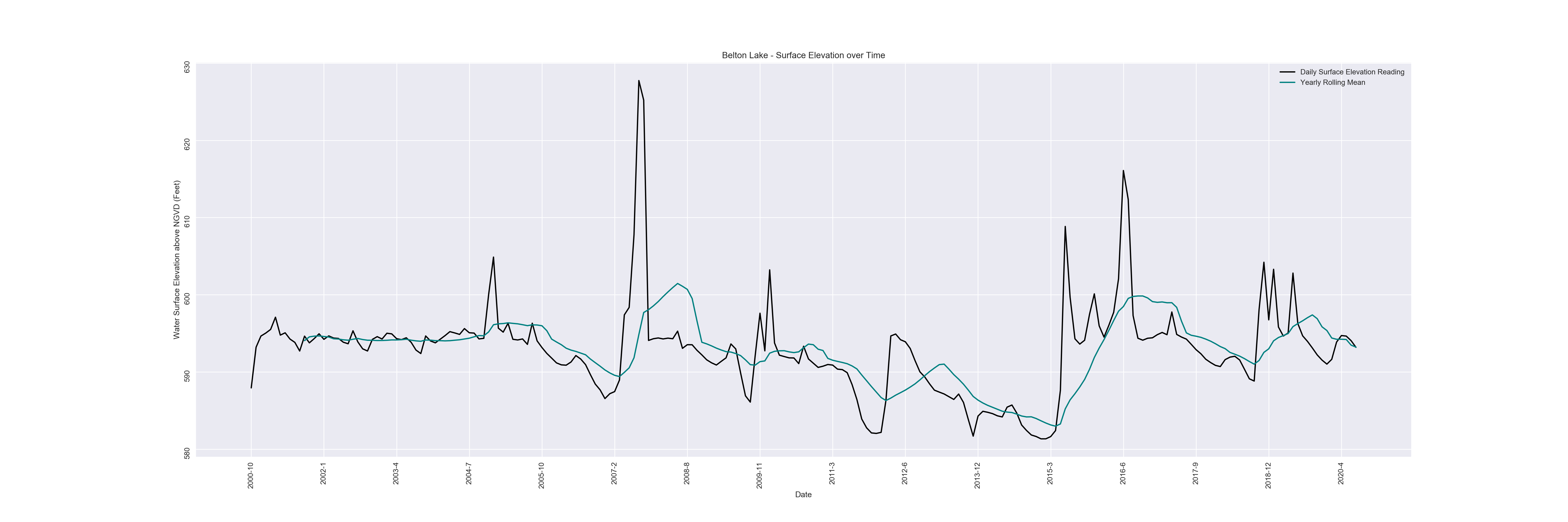
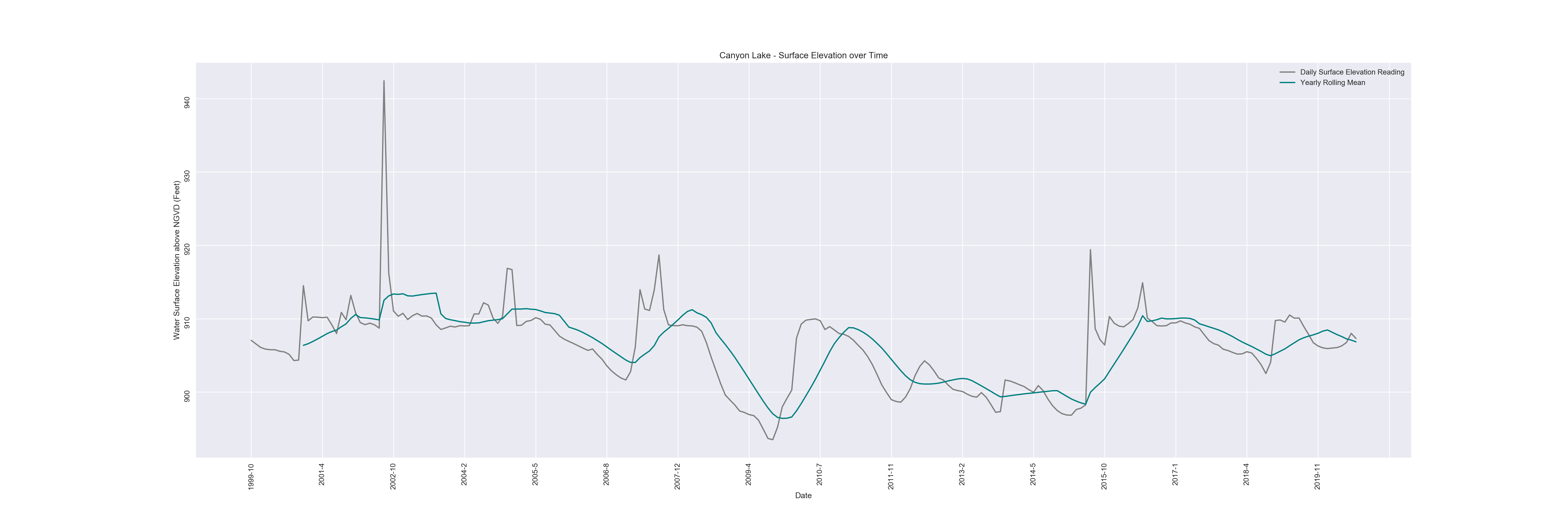
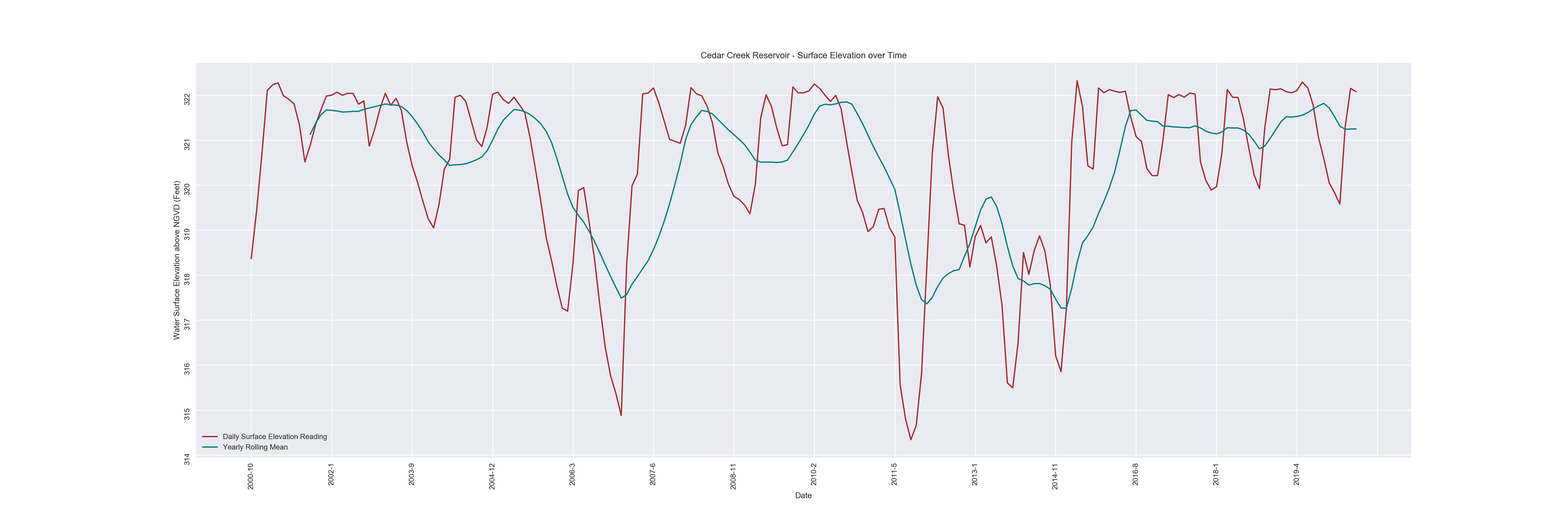
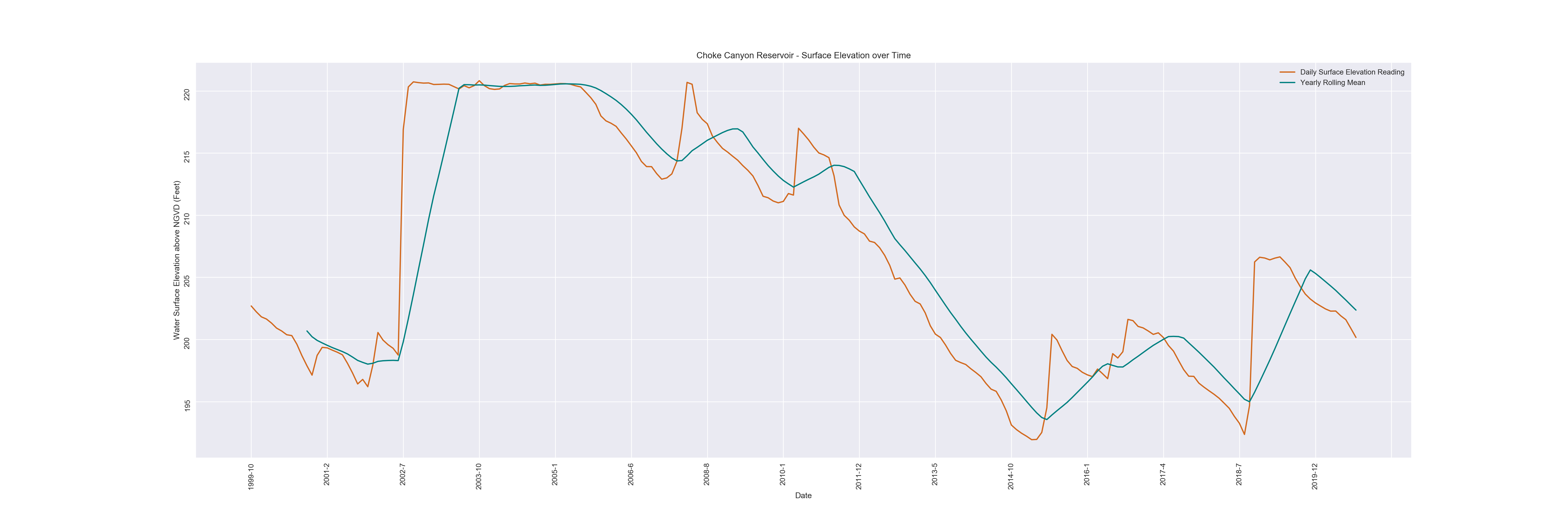
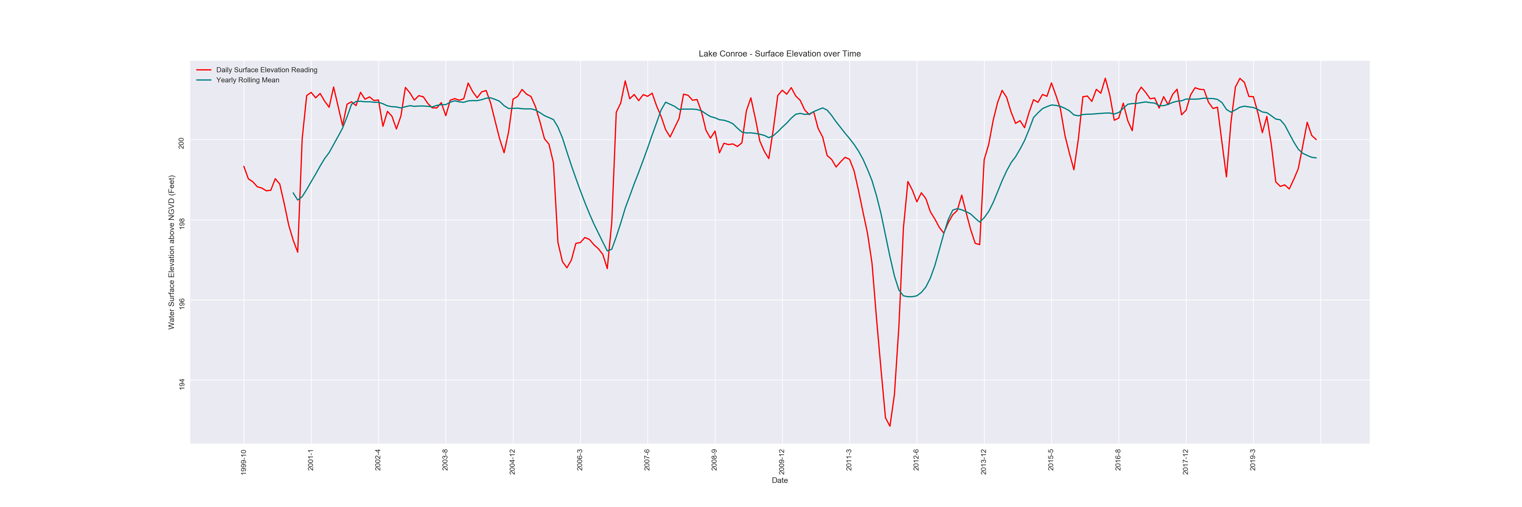
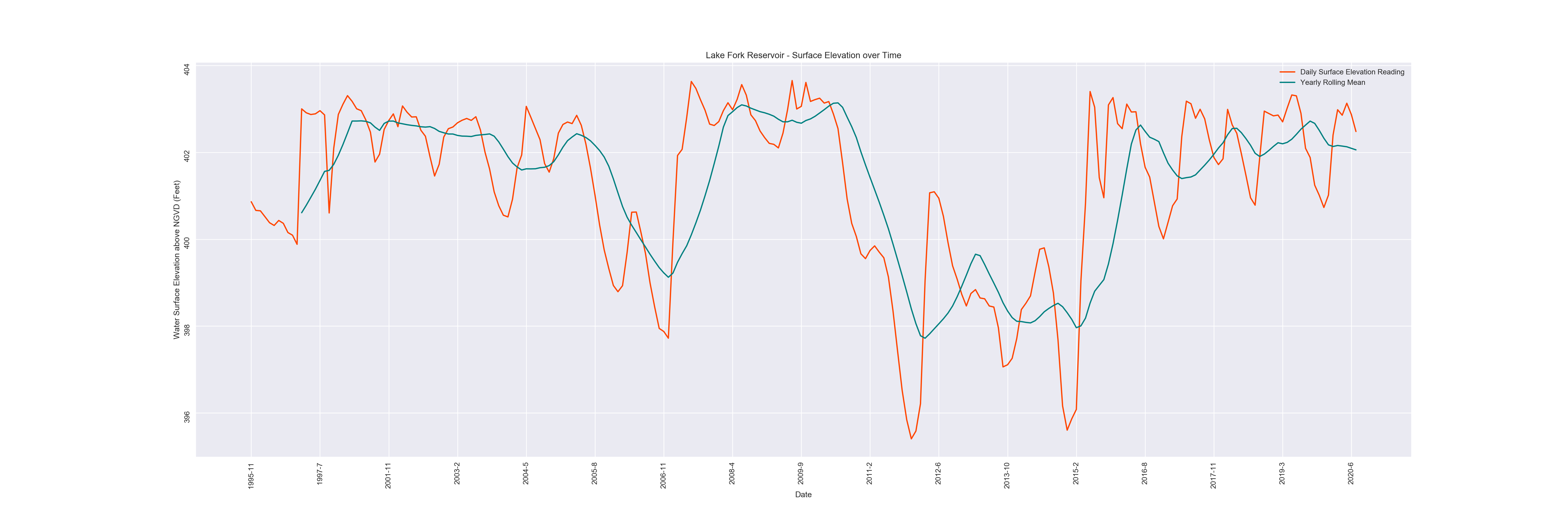
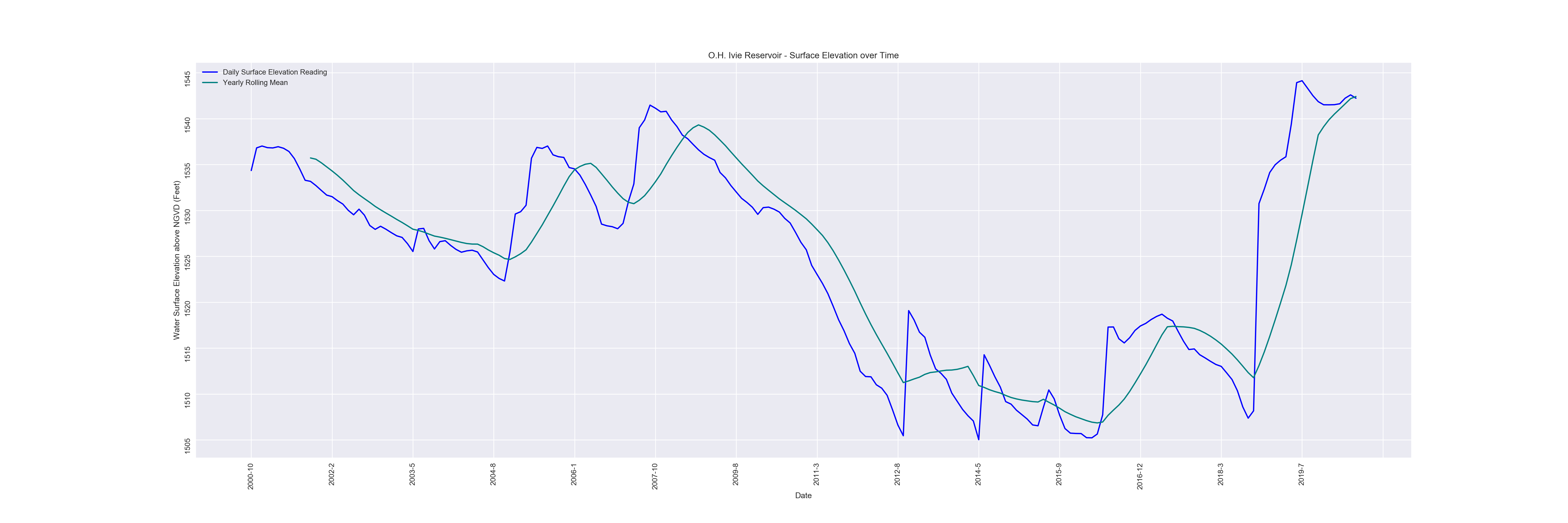
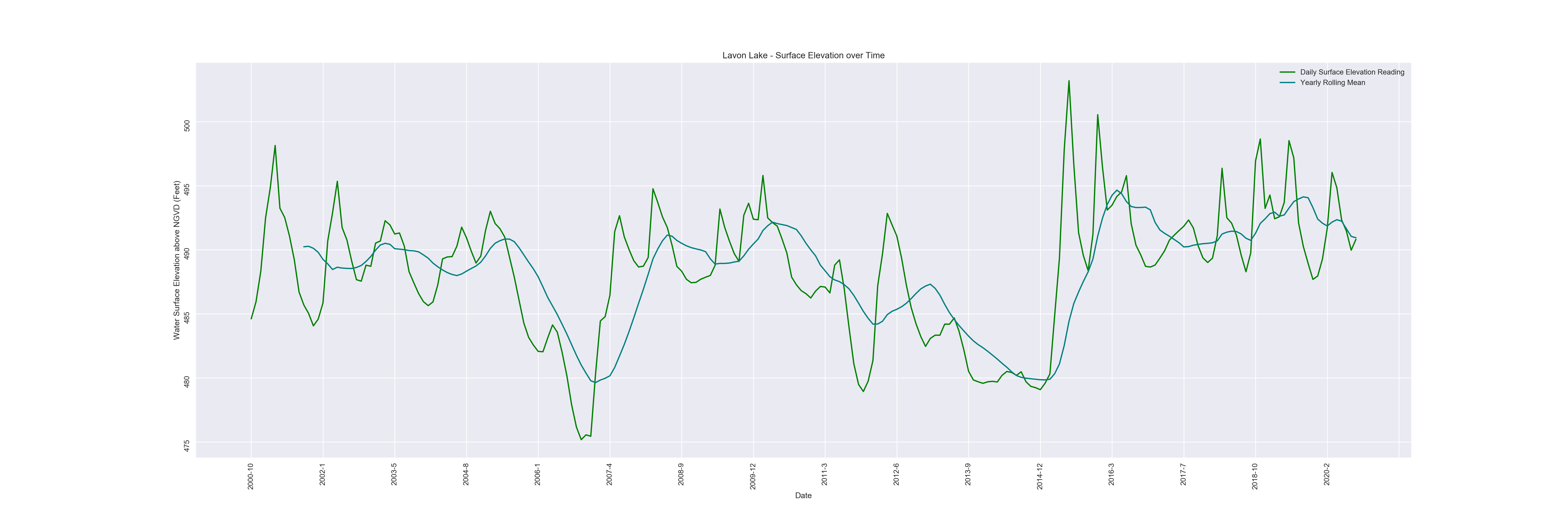
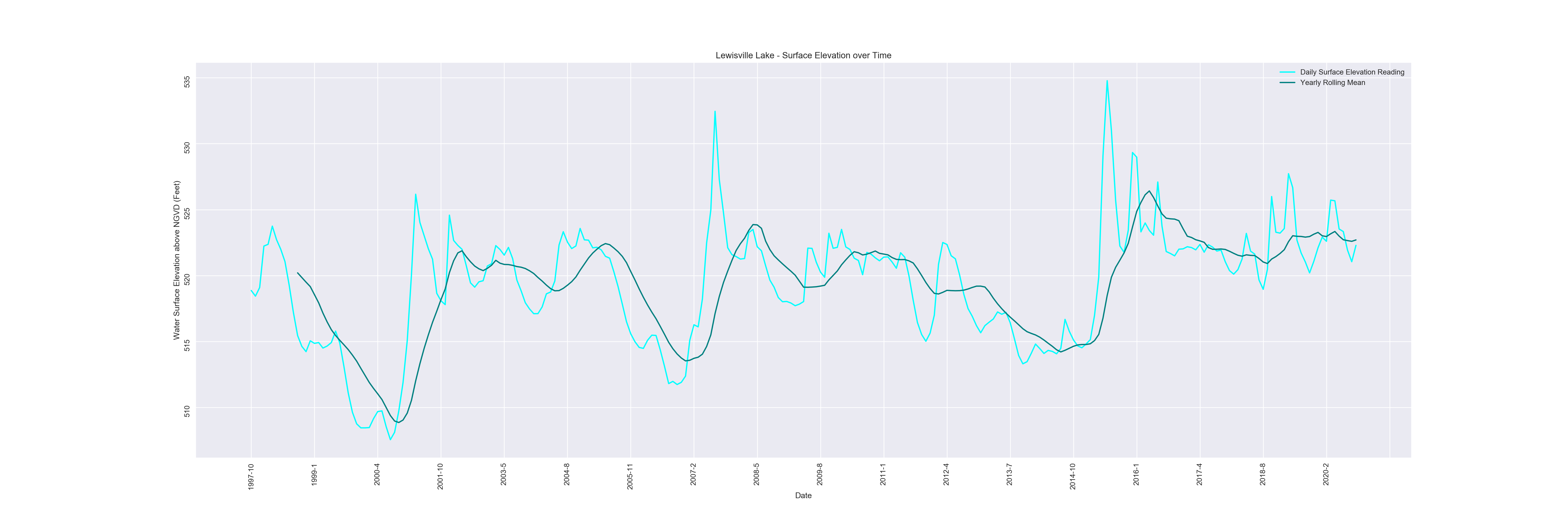
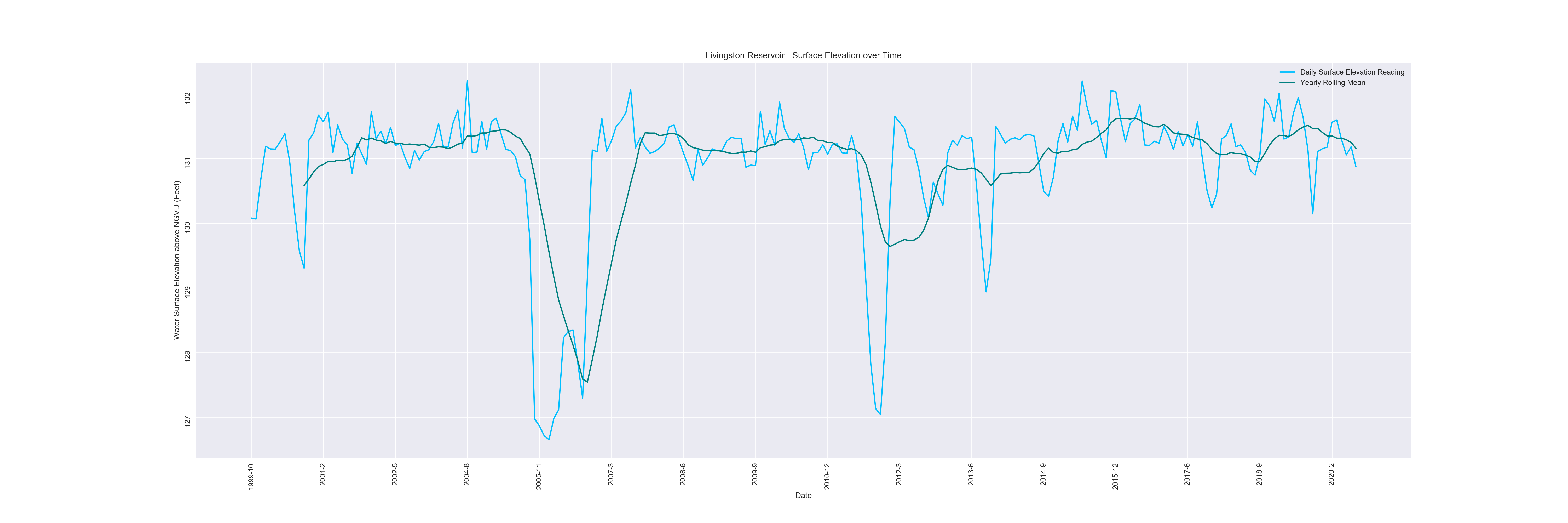
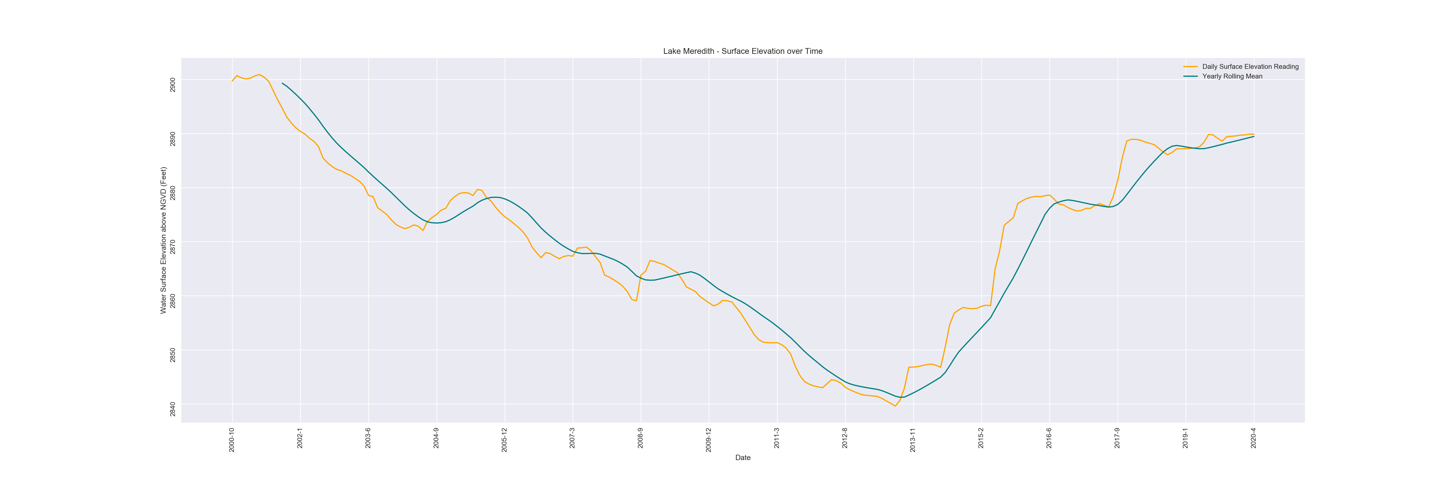
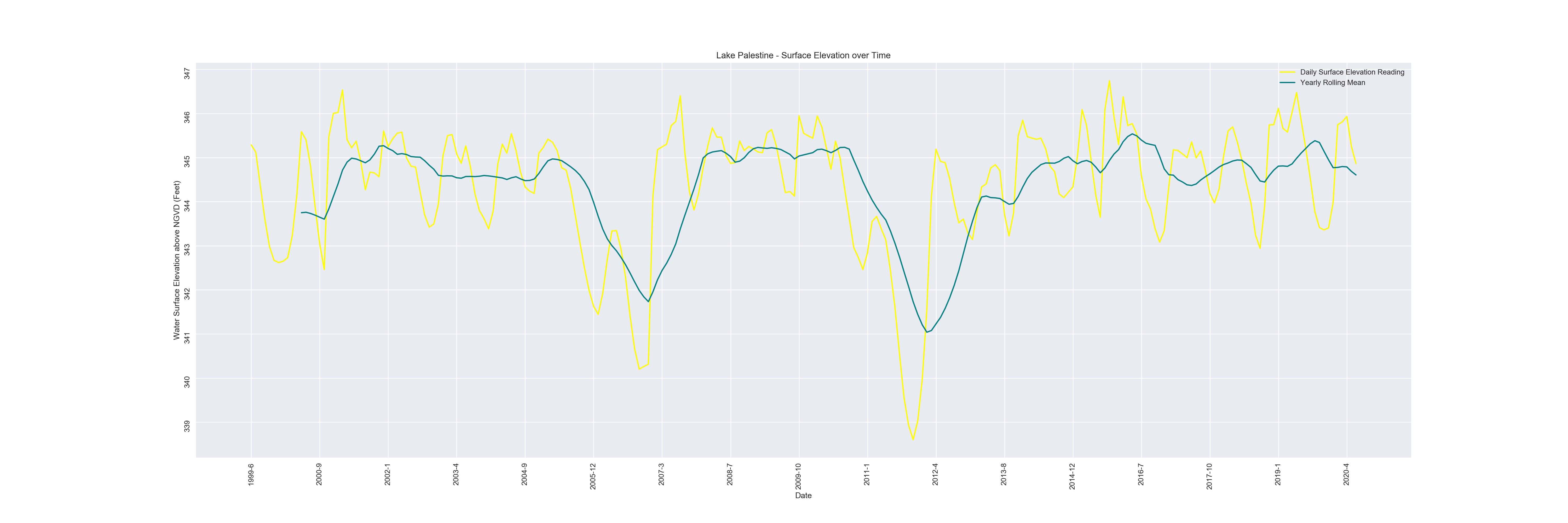
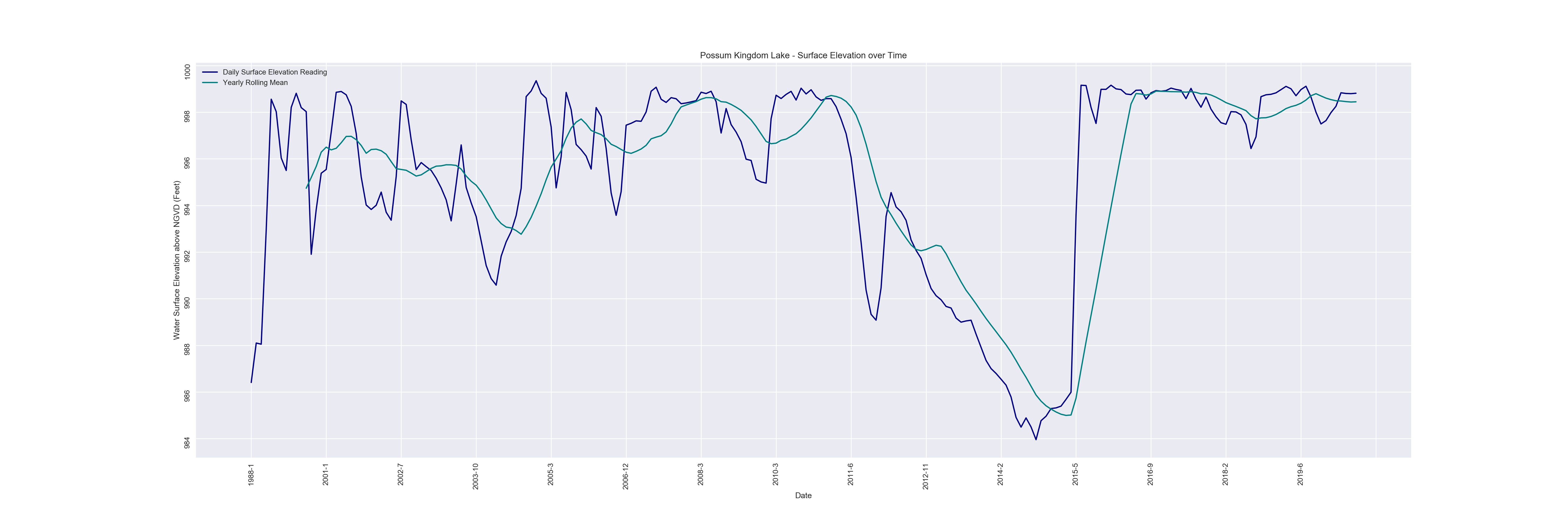
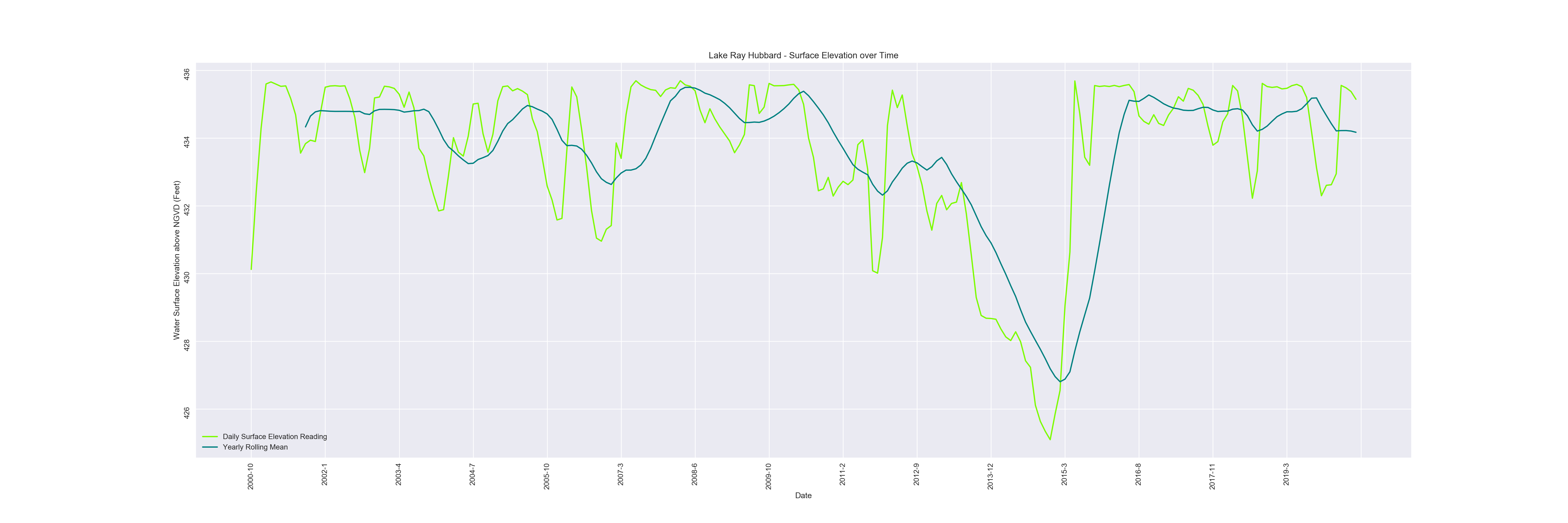
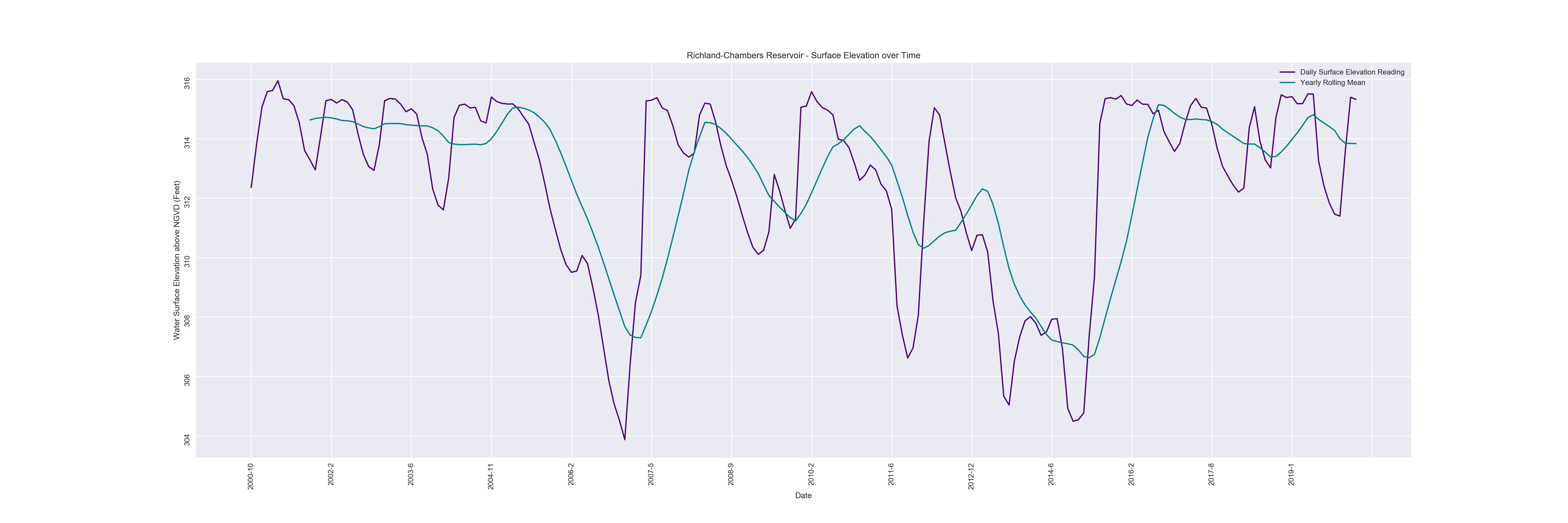
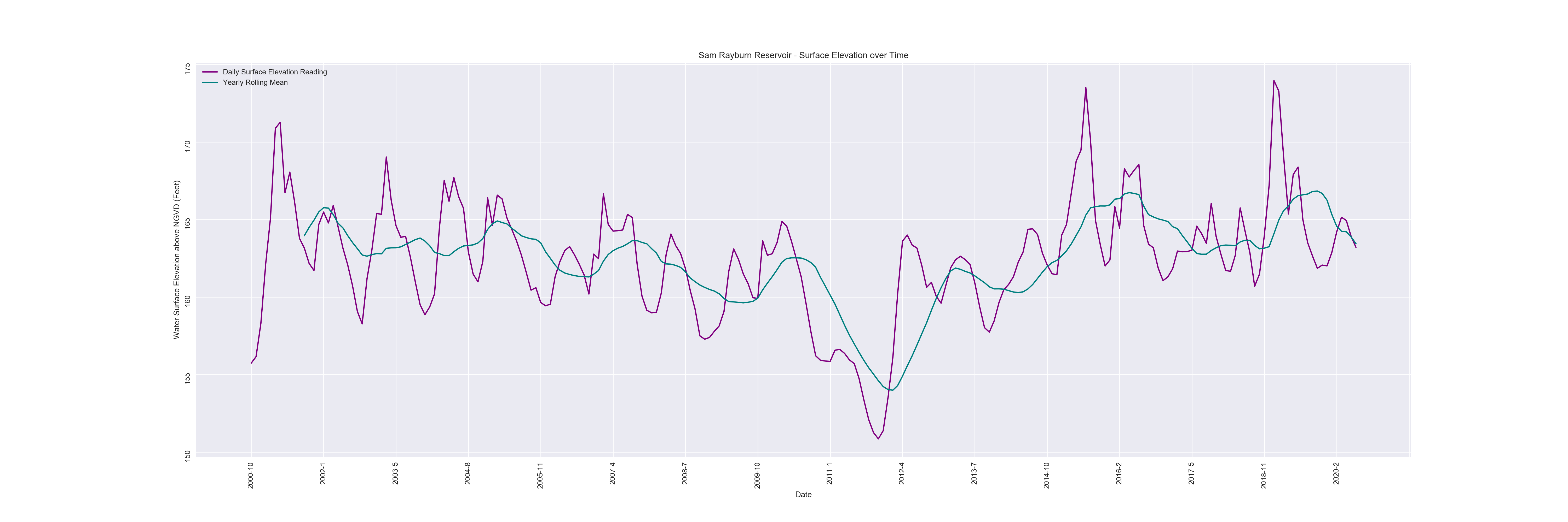
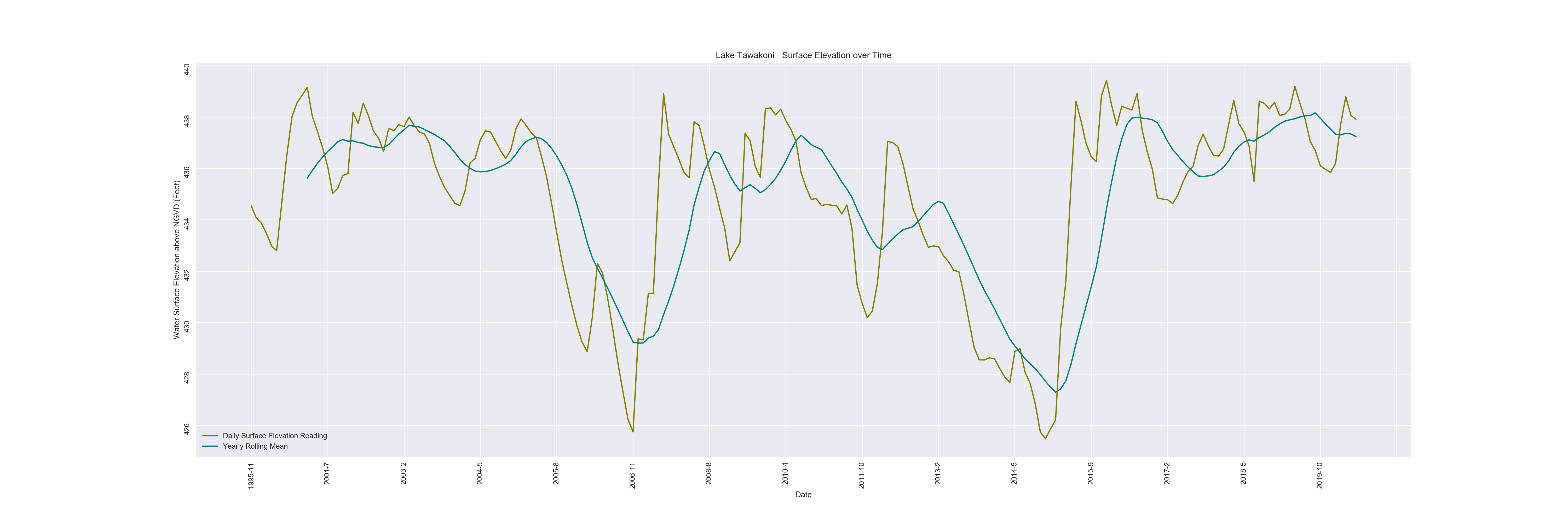
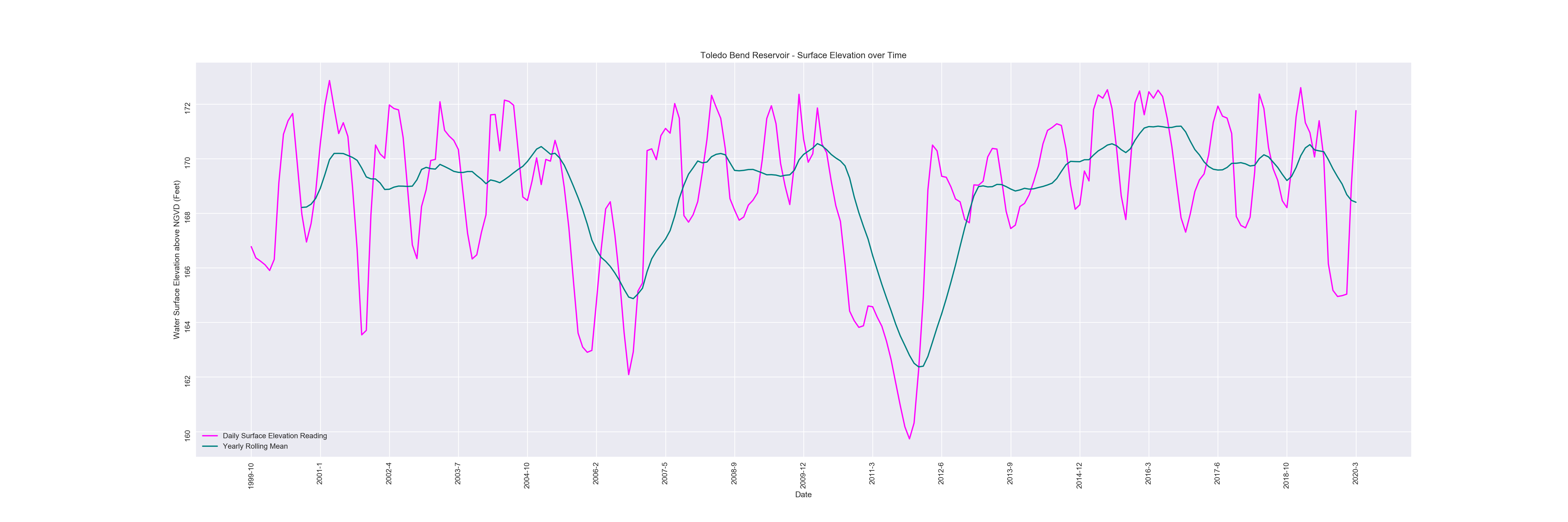
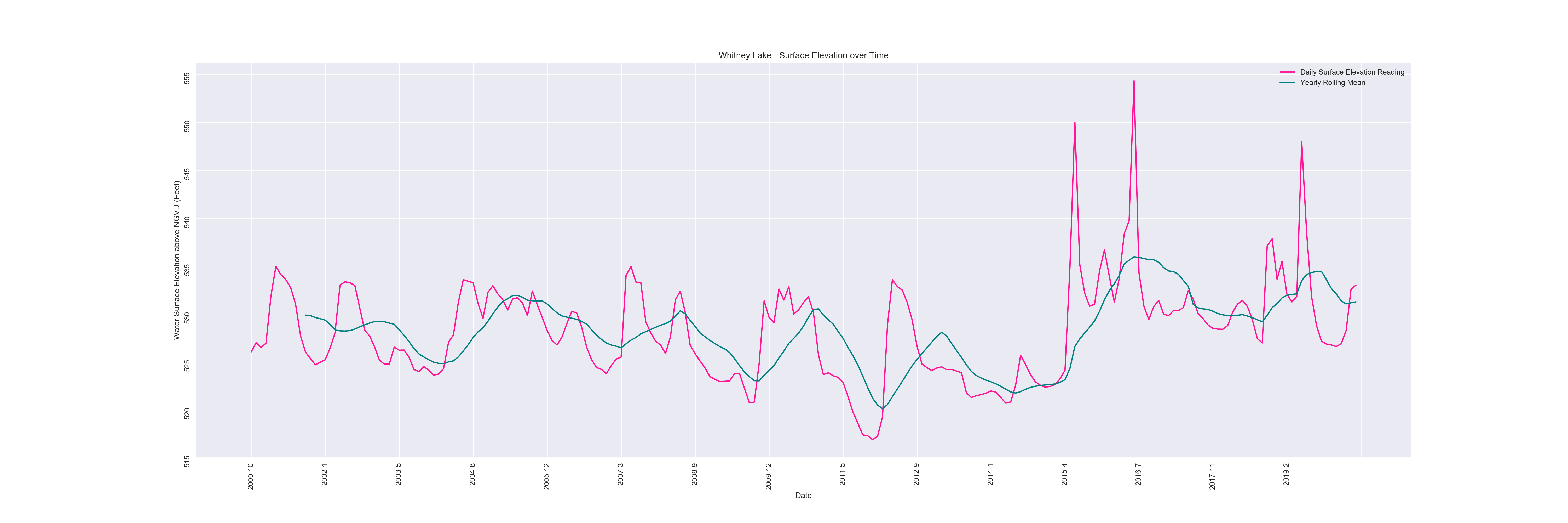
The metric used in the dataset for the lakes graphs was Water Surface Elevation above the National Geodetic Vertical Datum in feet. In layman’s terms, this is similar to ‘above sea level’ in that it is a constant measure that can be used to normalize data from across large areas. The combined all lakes chart seems incredibly consistent, but this is due to the large range of scale along the y-axis. When looking at the individual graphs, it is clear to see that there is quite a bit of variability. The combined graph does show us areas such as 2015 and late 2015 where multiple lakes show mumps in surface elevation at the same time, possibly suggesting large scale changes to rainfall or flooding. It is also important to note that since most lakes in Texas are human-made, there are dams all over the place which hold or release water based on human interaction. Still, we can see some consistent trends between many of these lakes, especially when reviewing the yearly rolling mean over monthly measurements. For instance, many lakes show sudden drops in elevation around 2007 and the mid 2010’s. With the exception of a few lakes, the last five years have been a period of either water level rise, or water level consistency at higher elevations. This may suggest periods of drought around 2015, followed by a long period of consistent, heavier rainfall. Since Texas is a coastal state near the Gulf of Mexico, this data may also be heavily influenced by Hurricane and Tropical Storm activity as well.
Individual Lake Charts